Kajabi Website Launch ✧ His Mighty Warriors

Let's do a happy dance for the launch of Jennifer Hicks’ new website, His Mighty Warriors, a platform dedicated to empowering women through Bible studies, events, and community support as they grow in their faith journey 🥳🎉
Working on this project with Jennifer has been a truly rewarding experience, and I am so excited to share the details of this powerful new resource for Christian women.
Jennifer Hicks' vision for His Mighty Warriors is to create a space where women can come together to strengthen their faith, find encouragement, and walk confidently as God's Mighty Warriors. The website serves as a central hub for bible study groups, event information, and community interaction, all aimed at fostering a sense of unity and purpose among its members.
"Sierra is great at blending her expertise with my wishes to create something that went beyond my dreams! I love that she's able to take "rough" dumps of content and create order and beauty from them. She captured the essence of our voice as a nonprofit from the very beginning and was able to carry that throughout multiple elements. "
Jennifer Hicks, His Mighty Warriors
Some of our favorite highlights of Jennifer's new website:
💕 Intuitive Navigation and Messaging: We implemented a clean and intuitive navigation structure to ensure visitors can find what really speaks to them. Visitors can easily find Bible study resources, event details, and community forums.
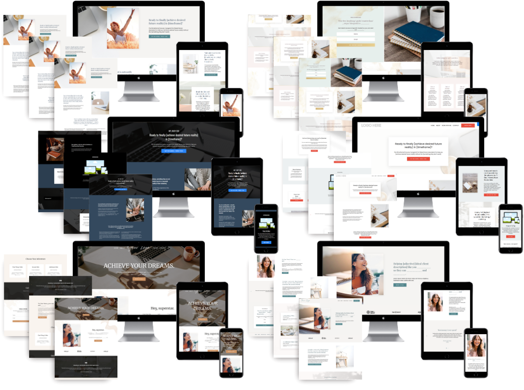
💕 Vibrant Aesthetic: We worked with Jennifer on a vibrant color palette and inspiring imagery to reflect the energy and positivity that Jennifer brings to her teachings.
💕 Responsive Design: Understanding the importance of accessibility, we ensured that the website is fully responsive, providing a seamless experience across all devices.

I asked Jennifer to share her favorite parts of working together, and what she loves most about her new website:
What is your favorite part of your new design and set up?
"Hard to say -- there are SO MANY THINGS TO LOVE!!! I love how it truly feels like our brand. I love how many goals we were able to accomplish while keeping everything organized and clear. I love that I'm now eager to share my site with others -- previously, my site contained the essentials, but this site is my dream site in both aesthetics and functionality. I am thrilled!"
How do you think this update will impact your business?
"Previously, my site was functional for mostly providing information and event registration. Now we have 5 courses in place plus a community and a program that combines multiple elements. It went from being a static site to being an interactive one that invites the viewer to get involved. I believe this is going to be a game-changer for us in the near future."
Did we successfully accomplish your design goals? What was your favorite part about working together?
"You exceeded my design goals! Sierra is great at blending her expertise with my wishes to create something that went beyond my dreams! I love that she's able to take "rough" dumps of content and create order and beauty from them. She captured the essence of our voice as a nonprofit from the very beginning and was able to carry that throughout multiple elements. Yet, any time I reached out to tweak/change something, she listened carefully and we talked through the benefits/negatives of different solutions. Sierra is very responsive and incredibly patient. Her positive "sure, we can do that" vibe overflows in all of her interactions, and she genuinely was a JOY to work with!
Having Sierra and her team navigate the overwhelming process of redesigning an entire website was incredible. Without them, I'd still be cringing when I tell people my site is "coming soon." In today's environment, a beautiful yet functional website is critical to building brand loyalty and authority. Don't wait to get all your ducks in a row -- they never will be! Sierra will help you sort through your thoughts, ideas, and goals so just dive in and get started today! You won't regret it."

🚨Get the FREE Checklist
Skip the Kajabi tears—Swipe the free Coach Website Checklist & Funnel Map
Exactly what should go where on your Kajabi site to maximize coaching leads.


