5 Best Health Coach Websites to Inspire Your Next Redesign
Your website is often the very first place someone experiences your coaching. It’s where people form their first impression, get a feel for your personality, explore your offers, and decide whether they feel supported enough to take the next step.
The best health coach websites don’t just present information. They create a connection. They help people feel understood and hopeful about the transformation they’re looking for.
If your website feels outdated or no longer reflects the heart of your coaching practice, it can quietly hold you back. Your digital home should feel warm, grounded, and aligned with the way you support your clients. And maybe you’ve noticed this, it doesn’t need to be complicated. It just needs to feel like you.
When your website design and message align with how you coach, people can feel it. They look around and start imagining what’s possible for them. I’ve seen this happen over and over with clients, and it still feels like magic every time. 💫
What Makes a Health Coaching Website Stand Out?
Top health coach websites start with clarity. Visitors should understand who you help and the sort of outcome they could expect if they work with you. When your language speaks directly to your ideal clients, they’ll know right away that they’re in the right place.
Your site should also highlight the transformation you offer. People usually aren’t just searching for information. They’re searching for more energy, more confidence, a fresh start, or a better way to care for themselves in a busy life. When you communicate those outcomes in a warm and grounded way, your website becomes an invitation into what’s possible.
Your visuals play a big role, too. Clean imagery, aligned colors, and layouts that guide the eye all help create a sense of trust. When your digital space feels calming and consistent, people naturally relax into the experience.
Great websites don’t force visitors to guess what to do next. If they’re ready to explore your work, book a session, or download a helpful guide, that path should be right in front of them. Your website should feel connected to the way you coach.
👉 Check out: Websites for Coaches: 10 Features Your Site Needs Now
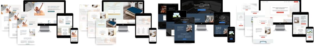
5 Best Health Coach Websites to Inspire Your Next Redesign
If you’re looking for a little inspo, here are a few health coach websites I’ve designed. You’ll see how small choices in layout and messaging can create a website that feels calm, supportive, and aligned with the way you actually coach.
Let’s take a look. 👀
1. Anna Wolyn, Wellness Solutions By Coach Anna
Anna wanted a website that reflected the kind of support she offers her clients: grounded, compassionate, and rooted in real-life wellness.
As a health and wellness coach, her work centers on helping women rebuild trust with their bodies, create sustainable habits, and move away from all-or-nothing approaches to health. Her site mirrors that philosophy with a calm, welcoming design that makes it easy to slow down, breathe, and feel understood.
Visitors can explore her coaching offerings, learn about her holistic approach to nutrition, movement, and mindset, and quickly get a sense of how Anna meets clients where they are.
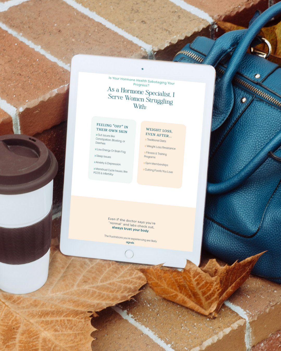
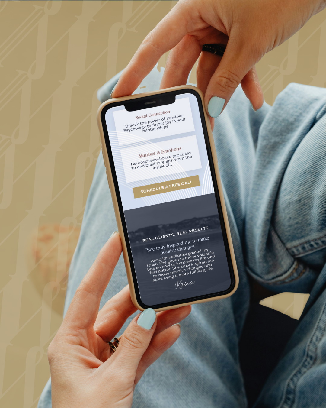
2. Sabra Cawby, Sabra Cawby Wellness
Sabra supports women who are navigating hormone imbalances and want to feel better in their bodies without extreme diets or burnout-driven wellness plans.
Her website reflects that intention clearly, blending a calm, grounded design with language that speaks directly to hormone health, cycle awareness, and sustainable lifestyle changes. From the moment visitors land on the site, it’s clear that her work focuses on understanding the body rather than fighting it.
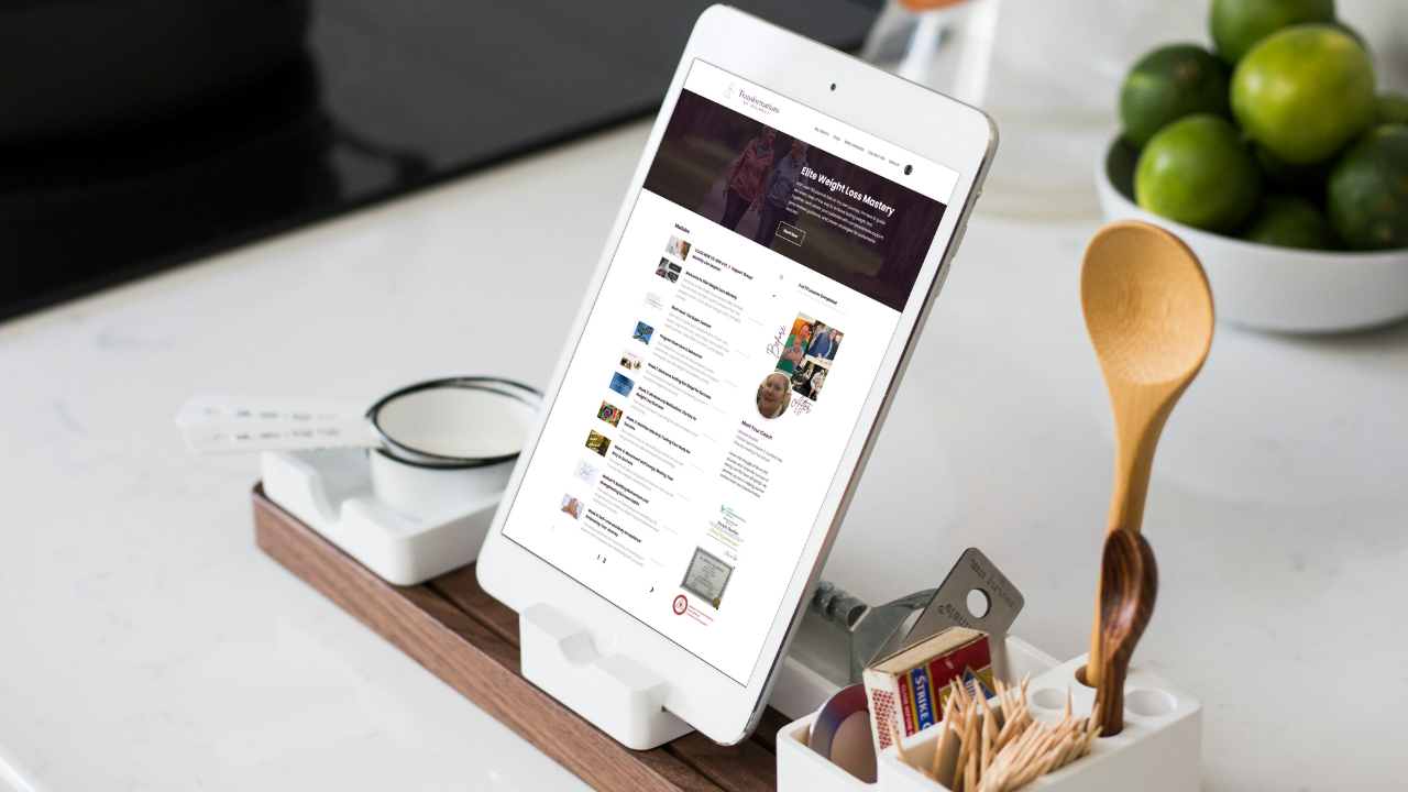
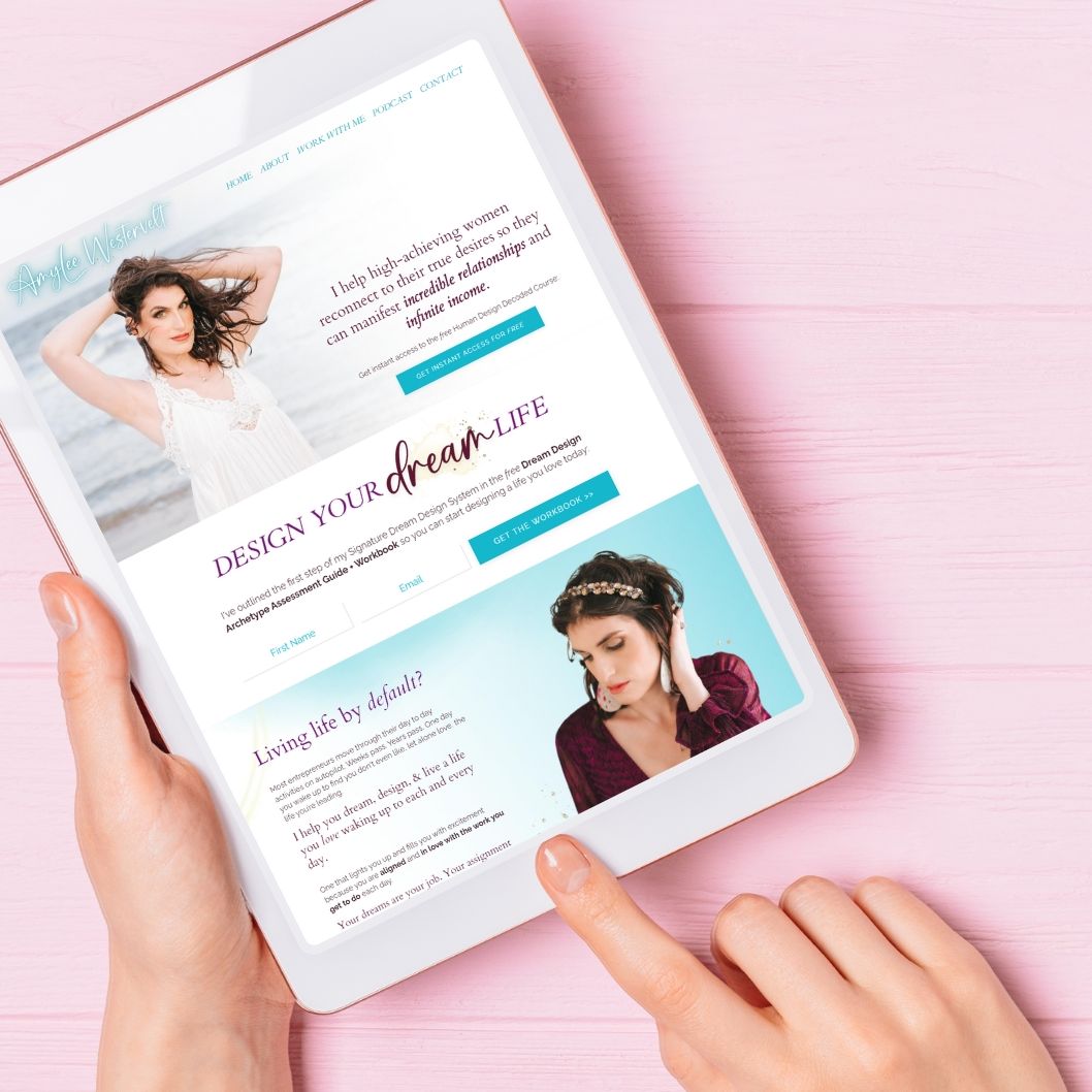
3. Michele Douthitt, Transformations by Michele
Michele’s brand has a luxurious, high-end feel, and her redesigned website finally reflects that same level of beauty and intention. Her course area and client library have a rich, elegant look that feels elevated without ever becoming overwhelming. The colors, spacing, and overall flow create a smooth experience that helps clients stay focused, motivated, and supported as they move through her program.
If you’ve ever wished your course space felt as thoughtfully crafted as your main site, Michele’s site shows how powerful that kind of upgrade can be. Her clients now move through a space that feels inviting and enjoyable to use. It gives her entire business a fresh sense of confidence and polish.

4. Clare Owens, Staal Physical Therapy & Fitness
Clare wanted a website that felt helpful and easy for clients to navigate. Her design is calming with soft, modern colors that echo her approach to strength, balance, and sustainable movement. Visitors can explore her programs, learn about her philosophy, and get a sense of the thoughtful way she blends physical therapy with fitness coaching.
The best part is how smoothly everything runs behind the scenes. Tasks that once pulled her away from clients, like inquiries and onboarding, now flow automatically through her site. This gives her back valuable time, creating more room for her growing community. The whole experience feels true to the heart of her work, and that’s what makes her wellness brand feel grounded and trustworthy.

5. Danielle DiMezza, Incite Nutrition and Fitness
Danielle works with athletes and high performers who take their wellness seriously, so her website needed to reflect that same level of focus and professionalism.
The design is clean and grounded in evidence-based expertise, which helps visitors immediately understand the intention behind her work. Her philosophy comes through clearly because the visuals and structure never get in the way of the message. It’s straightforward in the best possible way.
She also keeps her booking process incredibly simple, knowing her audience values efficiency and clarity. The site highlights her qualifications, her coaching style, and real client transformations, giving people a strong sense of trust early on. Danielle’s polished digital home shows how a streamlined user experience can elevate a coaching brand and make potential clients feel confident reaching out.

6. Robert Caliolo, Westlake Wellness
Robert helps clients move out of chronic symptoms and back into a life that feels steady and hopeful, and his Kajabi site captures that feeling in a really natural way.
Soft blues and greens set a calm tone, and the open layout makes his mind-body approach easy to understand. The whole space feels welcoming and professional, which mirrors the way Robert supports people through their healing process. People often mention how relaxed they feel just browsing it.
Every page has a purpose. Visitors can learn about his philosophy, check out his services, and see what makes his approach unique without feeling overwhelmed. It’s the kind of website that builds trust simply by how it feels to move through it. Robert’s digital home is a strong example of how thoughtful design can bring clarity and credibility to a growing wellness practice.

7. Jennifer Arnspiger, Highly Sensitive Healing
Jennifer’s website shows how design can shape the entire experience. She supports highly sensitive people with care, and her site carries that same peaceful tone from the moment you land on the page.
Soft colors, spacious sections, and calm, steady messaging create an environment that feels safe to explore. Visitors can move through her coaching, writing, and resources with ease. It has a softness to it that people pick up on immediately.
Her new digital home also gives her plenty of room to express her voice and invite people into her world. Each section guides visitors toward the work that fits their needs while offering a clear sense of who she is and how she supports her clients. It feels warm and reflective of the way Jennifer shows up in her practice.
What These Websites Have in Common (Design + Strategy)
These coaches serve different parts of the wellness world, but their websites have many of the same core principles. Their messaging feels clear and supportive, speaking directly to the clients they want to reach. Their visuals match the tone of their coaching, which helps build trust right from the start.
Navigation is simple, and each site shows the transformation clients can expect through stories, testimonials, or clear explanations of their process. Together, these elements create an experience that feels inviting and easy to move through.
When design and messaging work together, your website becomes a place where connection begins, not just a place to gather information.
Features That Make Health Coach Websites Convert Better
High-converting websites support visitors from the moment they land on the page.
Here are some features that convert:
- A strong hero section quickly explains who you help and what you offer, so people instantly feel understood.
- Simple navigation keeps them engaged without overwhelming them.
- Testimonials, transformation stories, and warm, conversational copy build trust fast.
- Clear calls to action make it easy for visitors to book a consultation, download a free resource, or explore your programs without second-guessing their next step.
- A blog or resource library adds credibility and gives potential clients a meaningful place to start.
All of these pieces work together to create a website that's inviting, intuitive, and supports your business and helps people say yes with confidence. 🚀
Tips for Creating The Best Health Coach Websites
The top health coach websites speak directly to the people you want to help. When your message reflects your clients’ goals and challenges, they’ll instantly feel understood. Share your story and your “why,” so visitors can connect with the heart behind your coaching.
Use warm, conversational language that sounds like you. Keep your visuals aligned with your brand’s personality so your digital space feels cohesive. Offer a simple free resource to help visitors take an easy first step. And make sure it’s always clear how they can get in touch with you.
When your website feels personal, intentional, and supportive, it becomes one of the strongest tools you have for attracting aligned clients.
FAQs
What Platform Is Best for Building a Health Coach Website?
Kajabi is my favorite choice because it brings website design, email marketing, course delivery, and automations into one simple system. It’s easy to use, mobile-friendly, and built to grow with your coaching practice as your clients and offers evolve.
Coaches love it because it brings together health and wellness programs, free resources, and paid services in one place, making running your business feel lighter and more organized.
How Do I Choose a Website Template for My Coaching Business?
The best template is the one that makes your content easy to understand. Choose something with a clean hero section, simple navigation, and enough space for your story and offers. When the structure fits your coaching style, it’s much easier to tailor it with colors, photos, and messaging that reflect who you are and the people you love to help.
How Can Health Coaches Attract More Potential Clients Online?
You’ll attract more of the right people when your message clearly reflects what they’re struggling with and what they hope to change. Share helpful, easy-to-digest content and keep your SEO basics in place so new visitors can actually find you. A simple free resource can also go a long way in giving people a feel for how you coach.
When your website reflects the support and real-life shifts you help clients create, it’s much easier for someone to see themselves in your work and take the next step toward connecting with you.
Should I Offer Free Resources on My Health Coach Website?
Yes. A free resource is one of the easiest ways to build trust. It helps potential clients understand how you teach, what you believe about health and wellness, and how you support real change.
Keep your resources simple, actionable, and aligned with your coaching message. When visitors feel that early win, they naturally become more interested in taking the next step with you.
How Do I Market My Wellness Coaching Business Effectively?
Effective marketing blends clarity, consistency, and connection. Pair your website with SEO, email marketing, social content, and resources that help your audience take positive steps forward. Speak to the results your health and wellness coaching creates, whether that’s more energy, more confidence, or better balance.
The Bottom Line
Your website should reflect your mission, your heart, and the transformation you help your clients create. An aligned and thoughtfully designed site is one of your strongest tools for attracting dream clients and growing your coaching business.
Ready for your own Kajabi glow-up? If you want a website that feels like you and supports your next season of growth, I’d love to help you bring it to life. ✨
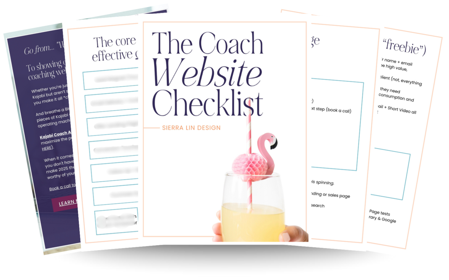
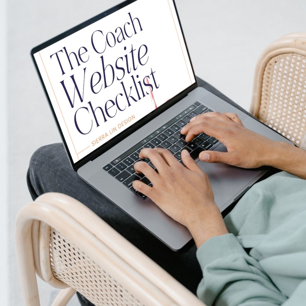
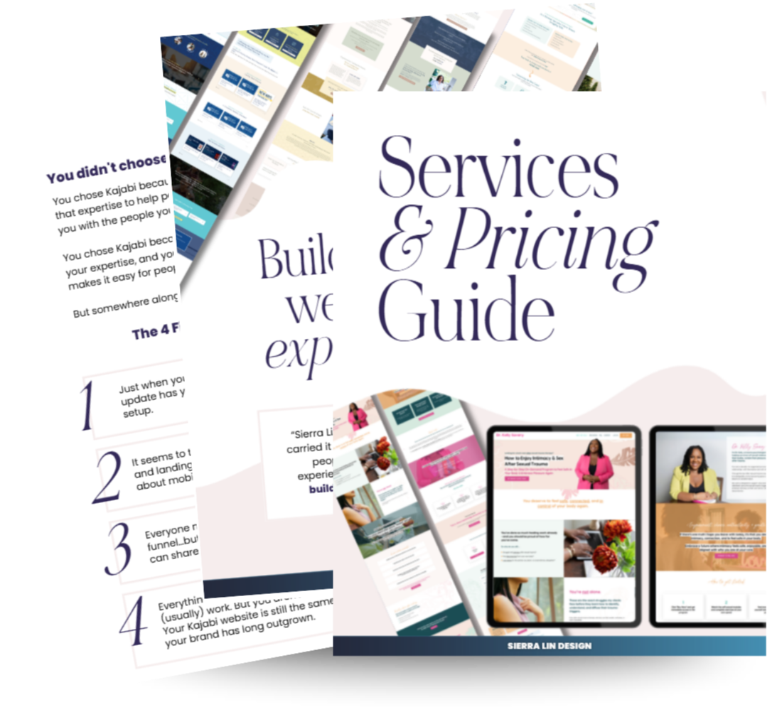
🚨Get the FREE Checklist
Skip the Kajabi tears—Swipe the free Coach Website Checklist & Funnel Map
Exactly what should go where on your Kajabi site to maximize coaching leads.