Website Launch: AllVersed Virtual Fitness and Nutrition Coaching
The events of this past year have thrown so many plans into disarray.
While I hope and pray that you find yourself and your loved ones healthy and at ease, I know that you have likely felt the effects of the pandemic in your life.
Fitness trainer Margarita Amosa of AllVersed found her own career thrown off course when the gym where she worked was forced to close due to COVID19.
“I then decided it was time to train people online, and my first thought was to build a website to get myself out there,” shared Margarita. “I wouldn’t be able to reach out to people if I did not have a website set up.”
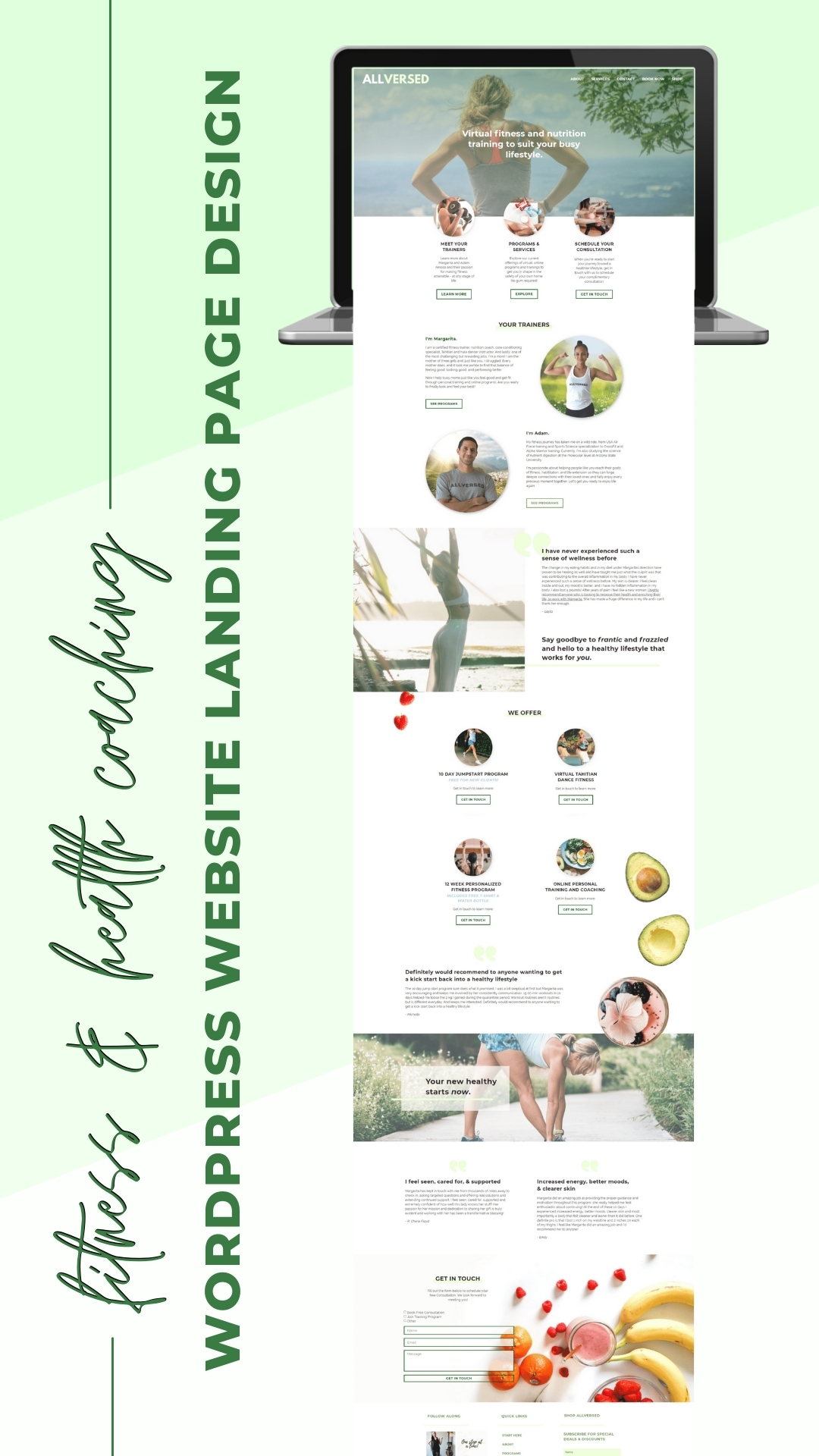
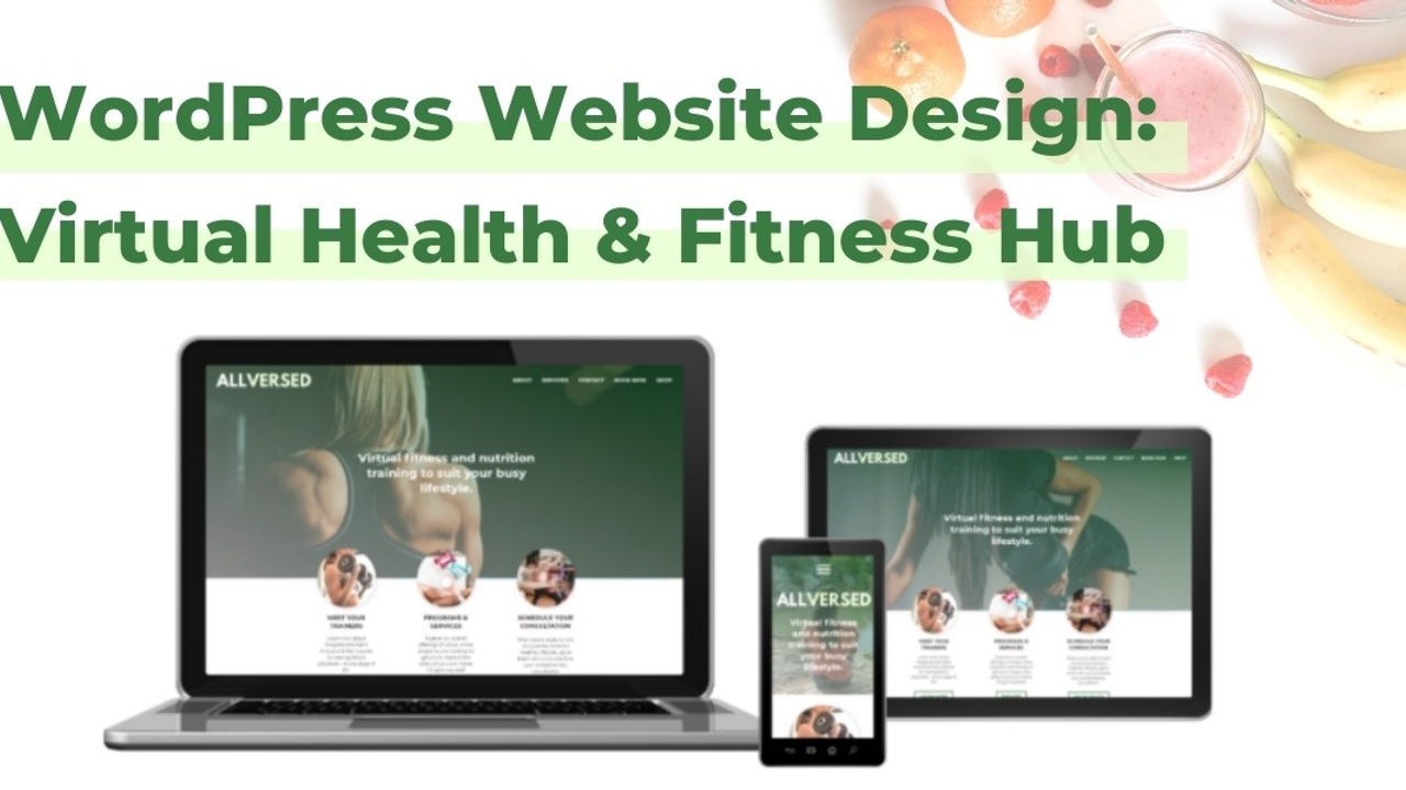
Margarita and I partnered to design a website to showcase her virtual fitness and nutrition training programs and services.
. . . and to make matters more interesting, we decided to design the website as a “landing style” page, meaning a single page would need to include all the necessary details of the AllVersed business – from services and programs to contact info!
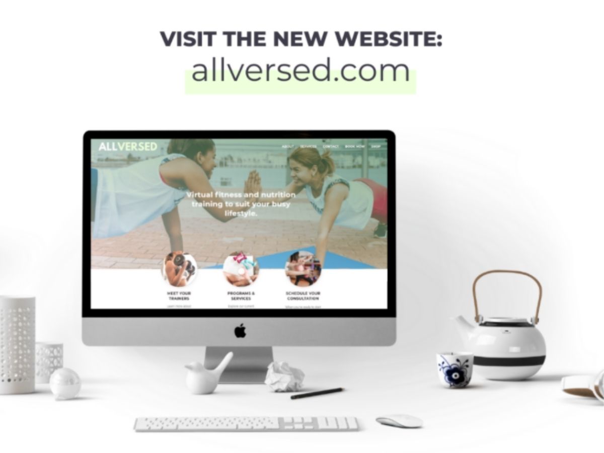
The result is the new AllVersed online platform: a bright, clean landing page style WordPress site motivating a diverse audience to get fit and healthy.
A few quick facts on this fitness and nutrition coaching website design before we dive into an interview with Margarita:
- Website Platform: WordPress
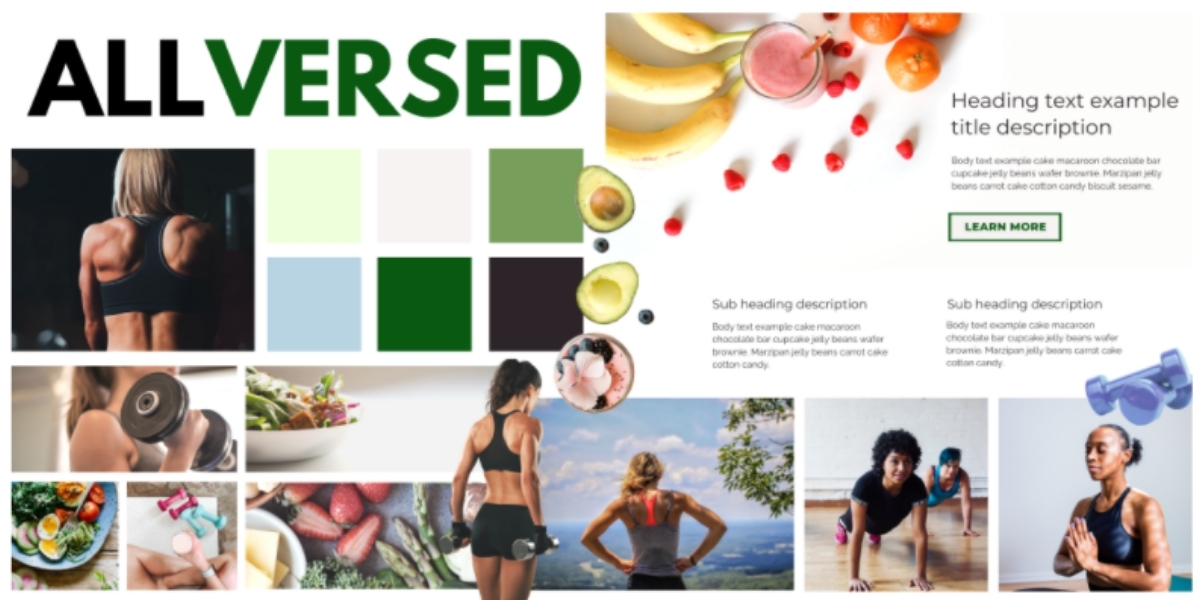
- Branding Notes: Fresh and motivational, with bright clean tones and sunny, relatable photos
- Color Palette: Clean white, soft lime, and leaf green with accents of summer sky blue
- Photo Notes: We specifically searched for stock photos showcasing a variety of Margarita and Adam’s ideal clients, across diverse settings and demographics. The goal was to make it easy for website visitors to imagine themselves working out and training in the comfort and safety of their own homes.
My favorite features of the AllVersed fitness coaching Website design?
- The streamlined and easy to follow layout of the landing-page style website. Simpler is always better when it comes to helping your ideal client navigate towards your final call to action.
- Engaging animation effects with the background photos.
- Fun, unexpected splashes of color in scrumptious healthy food close ups (I mean, come on, can you look at that smoothie or avocado on your screen and not want to whip up some yummy and nutritious snacks?)
- Instagram feed in the website footer (you know I love connecting on Insta!)
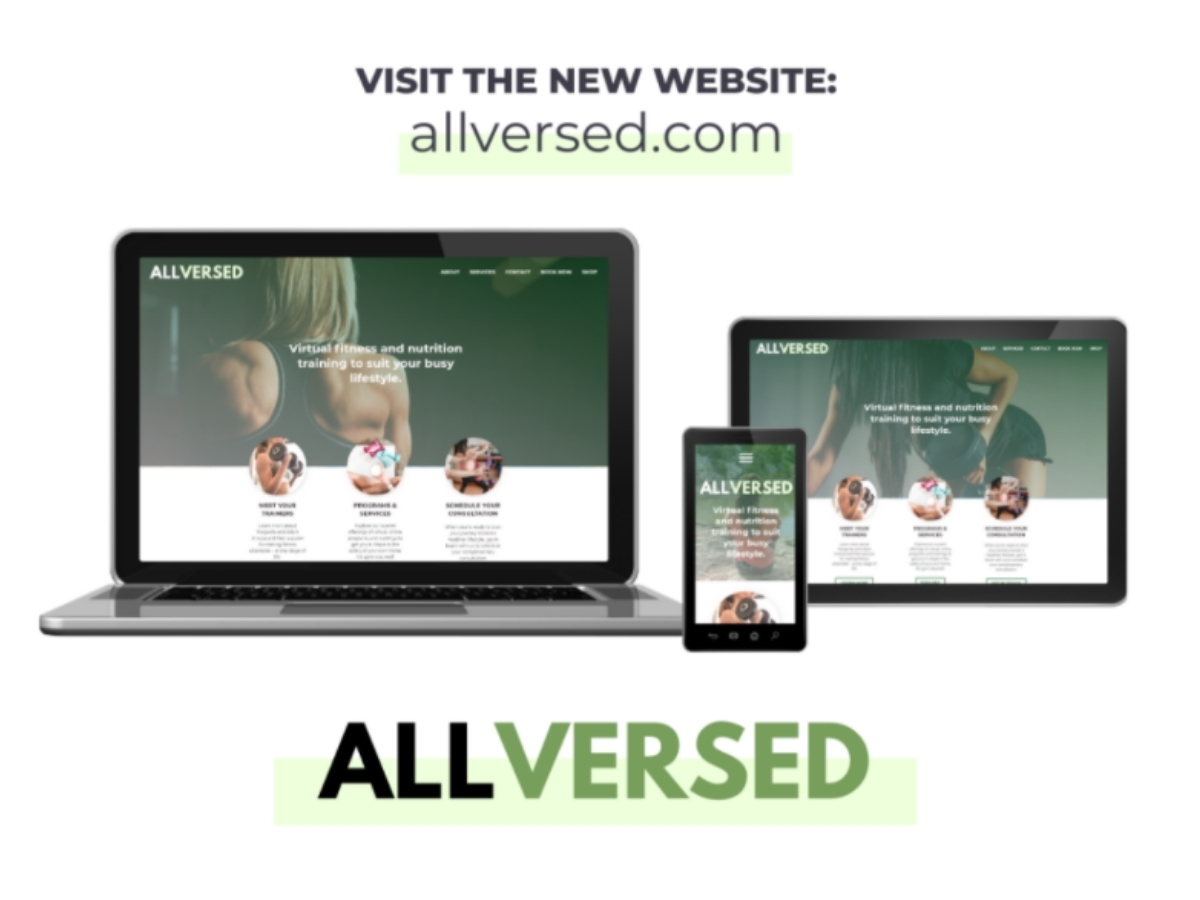
- And it almost goes without saying, but I’d be amiss not to mention that this website is completely mobile responsive (because don’t we all surf the web more on our phones now anyways?)
I asked Margarita to share her thoughts on the web design process:
1. What made you decide it was time for a website redesign?
"I use to work at a gym but when COVID happened my gym was forced to close and it affected most of the trainers, including me. I then decided it was time to train people online, and my first thought was to build a website to get myself out there. I love what I do and I know that I could still empower and transform people with their health and fitness journey and coach them online.
"I wouldn’t be able to reach out to people if I did not have a website set up. So that’s when I decided it was time! I believe that having your website makes a big difference especially when you want to get yourself out there and meet people you do not know. Build your clientele in the comforts of your home."
2. What are your favorite things about your new website?
"I love the layout of it and the picture slideshows. It looks clean and very professionally done!"
3. What was your favorite thing about working with me?
"You were very easy to work and communicate with. You are very professional when responding to my questions via email and messages. You take your time to explain and make sure I love my website. You also made a lot of changes for me especially last minute changes. Thank you!"
4. If you were to recommend me or my design services to others, what would you say?
"Sierra is AWESOME. She will definitely design your website the way you like it. She is very easy to work with and makes sure you know how to make changes even after the website is complete. She is very understanding and listens to how you would like your website to be."
5. What would you tell someone who’s considering working with me, but is on the fence about making their decision?
"You won’t be disappointed! I shopped around and if you know me I like to do my research first. Sierra is definitely the best designer you could work with!"
6. How do you think your new website will impact your business?
"I am super excited to launch my website. I like that it looks clean and beautiful. It shows diversity and I think it will attract my ideal client. Thank you Sierra!"
